How to Design a Fitness Logo |
Learn More About Designing a Logo
What You'll Learn
The purpose of this lesson is to show you how to create the right logo for your fitness business and show you some personal trainer logo ideas. You'll find out which elements can help to make your logo stand out the most. Plus, you'll learn about the different ways that you can create your new fitness brand logo.
Why is This Important?
As a personal trainer, you need to do what it takes to stand out from your competitors. As you are running a business you must devote some time to marketing. Part of any advertising strategy is to create a memorable brand. It's an obvious fact that a logo forms a crucial part of any branding exercise.
When you first become a personal trainer, getting your new logo right is important for a few reasons. First of all, it will help to differentiate you from other personal trainers. Second, it's a positive way to increase your brand's awareness. And, third, it's a design element you can use on all forms of marketing literature. Examples include flyers, websites, and social media.
The following five steps will tell you all you need to know about creating the perfect logo for your brand.
The following five steps will tell you all you need to know about creating the perfect logo for your brand.
Step 1: Understanding Logo Types
As a personal trainer, you'll be keen to build your brand and attract new clients.
All businesses, regardless of their size and what they do, have a logo. But, the one thing that sets apart successful enterprises is their branding. The idea of a logo is to offer a visual representation of who you are and what you do.
That doesn't mean you need a dumbbell or the silhouette of a male body. It means you need something that is easily recognisable and different to your competition.
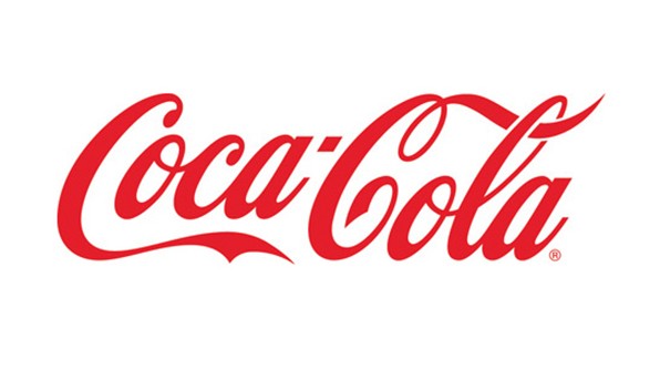
Take the Coca-Cola logo, for example. Everyone knows that it's a logo associated with a soft drink brand. There's no image of a soft drink but you know it represents a soft drink because they've made it memorable via their marketing channels. And computer giant Microsoft has a simple tile-centric logo with four colours in the form of a window. Simple. Memorable.
All businesses, regardless of their size and what they do, have a logo. But, the one thing that sets apart successful enterprises is their branding. The idea of a logo is to offer a visual representation of who you are and what you do.
That doesn't mean you need a dumbbell or the silhouette of a male body. It means you need something that is easily recognisable and different to your competition.
Take the Coca-Cola logo, for example. Everyone knows that it's a logo associated with a soft drink brand. There's no image of a soft drink but you know it represents a soft drink because they've made it memorable via their marketing channels. And computer giant Microsoft has a simple tile-centric logo with four colours in the form of a window. Simple. Memorable.
|
|
We could spend all day going through different examples of familiar brand logos. But, the point I'm trying to make is that they're memorable. They are also easily recognisable and convey the brand's image well. Those are some of the ingredients that should constitute the recipe for your brand logo.
Types of Logo
There are essentially three types of logos out there. It's important to know what they are:
Text Logos. People usually think that only graphic logos are memorable. But, there are plenty of well-known text logo examples that everyone knows, including Coca Cola. The secret? It's down to the creative use of typography! A text logo is ideal if you have no way to depict what your business does with an icon.

|

|
For example, Amazon's logo has an orange arrow underneath pointing from the 'A' to the 'z'. And search engine giant Google has a simple logo that consists of multi-coloured letters.
Text and Graphic Logos. They combine graphics and text as you would expect from a typical logo. The twist here is they literally illustrate what the company is about. One prime example is the Dove toiletries brand. Their logo consists of the word 'Dove' with an illustration of a dove underneath. A text and graphic logo is ideal if you need a way to make a text logo more official.

|

|
Abstract Graphic Logos. These are logos that use abstract designs. One relevant example is the Nike logo. Everyone knows that simple "swoosh" is Nike's branding! Brands usually have to spend a lot of time and money to make abstract graphic logos memorable. So, if you're setting up a new personal trainer business, the first two types are more appropriate.
|
|
|
Step 2: Logo Research
Now that you know the different types of logos you can create, we move onto the research phase. In a nutshell, this is where you think about the message you wish your logo to deliver.
The problem some personal trainers have is they're unsure what their logo should convey. Others might not be confident that the message they're broadcasting is the right one.
My advice. Don't overthink it. What you do with your logo and brand is way more important than how it looks (provided it's not REALLY UGLY of course).
If either of those scenarios rings true, don't worry. What you can do is write down a single-sentence mission statement about your brand. That way, you can focus on it during the research stage of your logo.
Next, take the time to see what logos your immediate competitors are using. Can you find any recurring themes with their logos? For example, do they use simple designs and pastel colours? Or do they opt for something more complex in each design?
If they've already researched the market, it could save you some time.
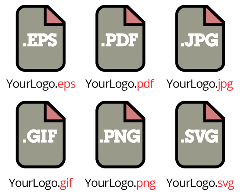
You also need to consider how to make your logo functional. What will you be using it on? If it's on a website, you'll need a PNG version (transparent background), if it's going on your T-shirt you'll need a vector graphic.
Below are some of the most common logo file types.
The problem some personal trainers have is they're unsure what their logo should convey. Others might not be confident that the message they're broadcasting is the right one.
My advice. Don't overthink it. What you do with your logo and brand is way more important than how it looks (provided it's not REALLY UGLY of course).
If either of those scenarios rings true, don't worry. What you can do is write down a single-sentence mission statement about your brand. That way, you can focus on it during the research stage of your logo.
Next, take the time to see what logos your immediate competitors are using. Can you find any recurring themes with their logos? For example, do they use simple designs and pastel colours? Or do they opt for something more complex in each design?
If they've already researched the market, it could save you some time.
You also need to consider how to make your logo functional. What will you be using it on? If it's on a website, you'll need a PNG version (transparent background), if it's going on your T-shirt you'll need a vector graphic.
Below are some of the most common logo file types.
Step 3: Choosing Colours
There is an almost limitless choice of colours that personal trainers can use for their logo. The only trouble is, the more colours you have in your logo, the higher the cost!
If you're only going to advertise online, it doesn't matter what colours you use. But, all fitness brands market themselves offline as well. Printing costs can soar if you use even five or more colours in your logo! Don't forget that you'll also need to get business cards and flyers printed out.
Planning on taking out a full-page colour spread in your local paper? Again, the more colours, the higher the cost! It's important to find a good balance between colour choices and cost for your logo.
When drafting versions of your new logo, try out some in one, two and three colour variants. You could find an ideal combination using fewer colours than you first thought!
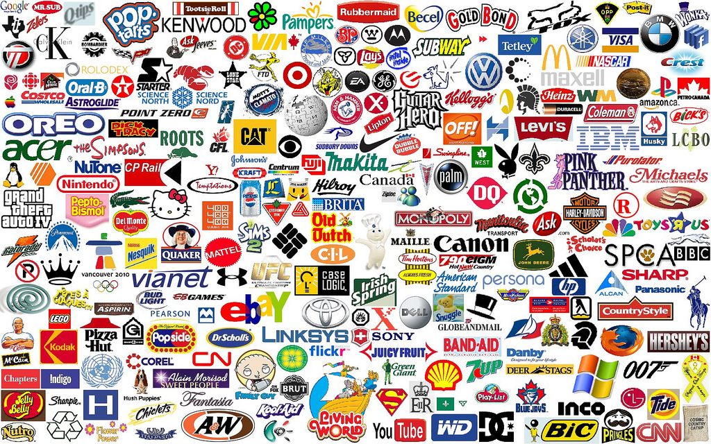
Notice how all of the most popular brands in the image below use one or two colors only...
If you're only going to advertise online, it doesn't matter what colours you use. But, all fitness brands market themselves offline as well. Printing costs can soar if you use even five or more colours in your logo! Don't forget that you'll also need to get business cards and flyers printed out.
Planning on taking out a full-page colour spread in your local paper? Again, the more colours, the higher the cost! It's important to find a good balance between colour choices and cost for your logo.
When drafting versions of your new logo, try out some in one, two and three colour variants. You could find an ideal combination using fewer colours than you first thought!
Notice how all of the most popular brands in the image below use one or two colors only...
Step 4: DIY Logo Design
By now, you'll have got the research and draft designs of your new logo sorted out. Now is the time to start working on the finished product!
There are two ways that you can create your brand's high-impact logo. The first is by using a DIY logo designer, and I'll expand on that in a moment. The other is to hire a graphic designer; more on that in step 5.
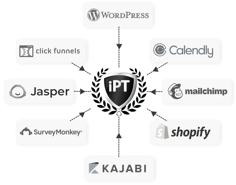
So, how can you design your logo using your own fair hands? Thanks to modern technology, you can use software on your computer or do it online. Software like:
The former option involves learning and using a graphic design program like Adobe Photoshop. With the latter, you can choose from an array of online logo designer websites.
If you're not the creative type, the latter option might be your best bet. Some sites will ask you a few questions about your logo. They will then automatically generate a few designs based on what you've replied.
There are two ways that you can create your brand's high-impact logo. The first is by using a DIY logo designer, and I'll expand on that in a moment. The other is to hire a graphic designer; more on that in step 5.
So, how can you design your logo using your own fair hands? Thanks to modern technology, you can use software on your computer or do it online. Software like:
The former option involves learning and using a graphic design program like Adobe Photoshop. With the latter, you can choose from an array of online logo designer websites.
If you're not the creative type, the latter option might be your best bet. Some sites will ask you a few questions about your logo. They will then automatically generate a few designs based on what you've replied.
Step 5: Hiring A Designer
If you can't quite get the effect that you are looking for with your new logo, all is not lost. Another option is to hire a graphic designer. In a nutshell, you pay a creative expert to transform your idea into an eye-catching design.
The way that the process works is simple. First of all, you research some graphic designers until you find one whose style you like. Site like Upwork and Fiverr.com are full of them.
Next, you provide them with a detailed explanation of what you want. This is called the 'design brief'.
You both agree on a timeframe and price to create the logo, and they then get started. During the process, they will share with you some draft designs. You can then ask them to tweak the logo until it is to your satisfaction.
As you can imagine, hiring a designer is ideal if you know what you want. What's more, it's an attractive option because freelancers won't charge you a fortune!